


Riders of the Pony Express - map board thoughts
I originally tried to use a thematic prototype board for Riders of the Pony Express:
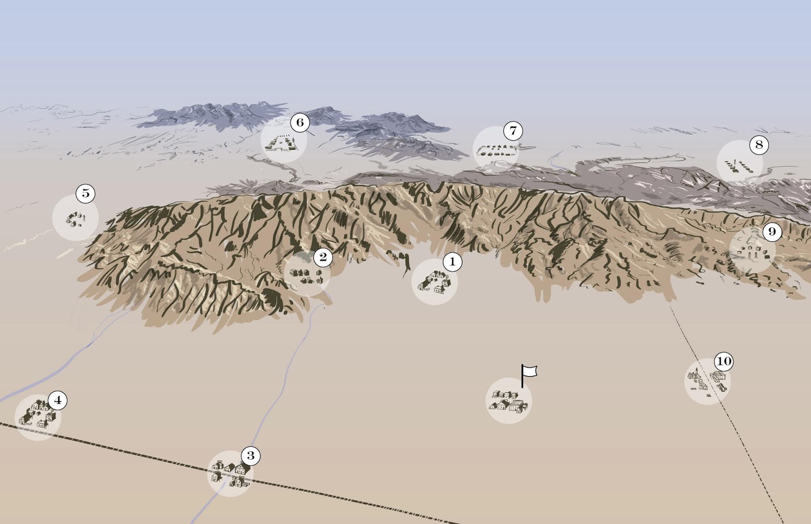
(I had drawn routes on this image)
But while iterating on the design, I quickly switched to a more schematic type of board:

A few iterations later, and that schematic turned into a bigger, more grid-like schematic:

I had originally wanted the routs to be asymmetric, so the board geography would be more interesting, but then I realized that that's what the hazard tiles are for! So I made the symmetric board shown above, with the "shortest" routes being the north-south and east-west ones, and the longest routes being the diagonal ones. The "cost" of the routes is supposed to represent the distance and danger of taking the route, and you pay it by advancing that number of spaces on the time track. At the end of the round, you collect a bonus based on your position on the time track - the farther you have gone, the less money (points) you receive as a bonus.
Hazard tiles will be placed in each of those red squares along the routes, which will add anywhere from +0 (tumbleweed) to +5 (mountain) to the route. These randomly placed hazards serve to make the board asymmetric, and to make certain towns easier to get to than others, or certain routes more expensive than others. This way, the board itself can be a simple grid, but the routes can be dynamic and interesting.
That's all well and good for testing a prototype, but when it comes to getting serious about the design, it would be great to figure out how to represent this schematic board in a more thematic way. In addition, the game is currently a bit fiddly to set up due to having to draw a bunch of hazard and items tiles, place them on the board, and then return some of them to the bag. One of my testers had the great idea of combining a few of the hazards onto single, bigger tiles, so that setup is easier, quicker, and less fiddly.
I wasn't sure how to do that at first, and I'd prefer to also make the board look less like a grid and more like an organic map. However, so far I've only managed to come up with this tessellation, which I think will work just like the schematic above, but with the hazards printed on them. Some of those hazard spaces could be empty, to be filled in later rounds as normal:

If the board were made up of tessellated tiles like this, then it might be good to keep the name of the towns fixed. To facilitate that, I was thinking that each tile could have a hole in it, so the town would show through the holes. This could hep keep it both thematically more accurate, and also easier or players to remember which town is where!
So what do you think? Should I stick with this tessellated tile idea? Or find another way to improve the board for the game?
No comments:
Post a Comment